Volli Native Mobile App Design
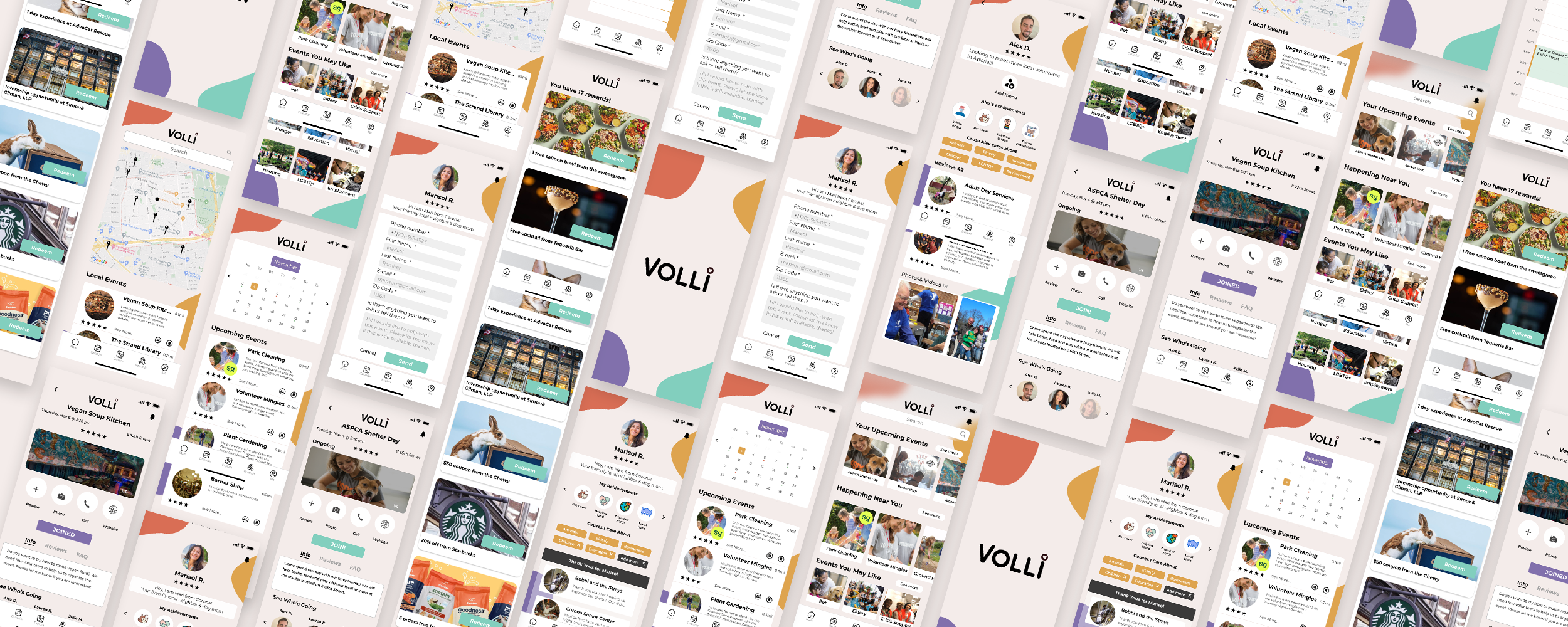
A speculative design project for a native iOS volunteering app. Volli helps connect users to localized volunteering opportunities in their community, and provides ways for volunteers to socially engage with others as well as receive rewards for their time & efforts.
Role (Product Designer & User Researcher): Design wireframes, user journeys, and full-working prototypes using Figma, collaborate with designers to strategize new user stories and conduct user testing.
Team: Laura Liu, Blake Weeks, Katerina Balgurina
Timeline: Oct - Nov 2022 (2 Week Sprint)
BACKGROUND
With over 326 million people in the US and less than 25% of the population volunteering yearly, there is potential to drastically increase the volunteer force through our youth. Even so, the percentage of volunteers has stagnated over the last 15 years.
While the benefits of volunteering are widely recognized; making a difference, giving back to the community, and developing new skills, young people need a way to be encouraged to see the value in volunteer work.
GOAL
Create opportunities for young people to be more engaged in their local communities thereby increasing event registrations and volunteer retention.

VOLLI APP WALKTHROUGH

As the lead researcher on the team, I sought out to better understand the volunteering space and what motivations and pain points people had about engaging with volunteering opportunities.
The research phase was comprised of two parts:
1) Market Research - Competitive analysis of the volunteer space
2) User Research - User interviews and screener survey

MARKET RESEARCH
Before diving into user research, we first conducted market research in order to identify what current volunteering platforms and adjacent products exist in the space and understand where our product would stand in comparison. We then did a competitive feature analysis which helped us understand what kinds of features users expected out of a volunteer platform as well as learn about what kinds of features our competitors did and did not currently offer to see how we could potentially differentiate our product.
WHAT WE LEARNED
Information about local volunteering opportunities is disparate and needs to be more organized
Most local volunteering opportunities do not offer a reward system for volunteers
Most events posted on other volunteer platforms don’t not provide a point of contact for events
There is currently no social network or community that exists on volunteering platforms
SCREENER SURVEY
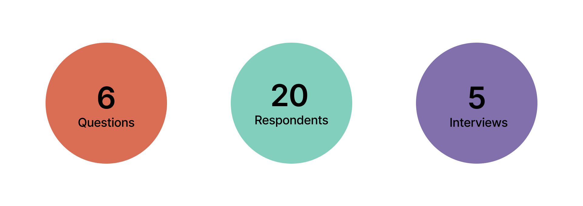
In order to ensure that we were speaking with the correct target audience, I created a screener through Google Forms and distributed it through various social networking platforms and contextually relevant volunteering forums on Reddit. Users who sorted in and were interviewed were either individuals who have volunteered in the past or have expressed interest in volunteering.

TAKEAWAYS
82% of respondents have volunteered before
90% of users have an interest in volunteering
40% of users volunteer a few times a year
Most respondents hear about volunteering opportunities through word of mouth
Volunteering information is often disparate and hard to access
The main deterrents of volunteering include commuting time and scheduling conflicts (work or personal)
USER INTERVIEWS
To better understand our user needs before we starting our designing process, we conducted 5 user interviews. Then we gathered qualitative information about users to organize ideas and synthesize data from interviews. Finally, we combined similar ideas into insights to better understand our user needs.
KEY INSIGHTS
Through speaking with users, I triangulated their responses and sentiments into six main key insights which ultimately would inform the way our team went about designing our product:
People want to be publicly recognized for the deeds that they do.
Volunteers would appreciate being rewarded for volunteering.
Users are receptive to events shared by people they know on social media.
Volunteers would like to be able to see the reviews and opinions of former volunteers for events.
People want to be able to find volunteer opportunities that are close to them.
Users want to be able to socialize, connect & foster relationships through their volunteer efforts.
After a brief first-round user interview, we synthesized the information gathered along with our key insights to create our User Persona.
PERSONA
Our persona Marisol represented our quintessential user of volunteers who want to get involved but having difficulties doing so. She guided our design process and helped us make informed design changes centered around the needs of our target user.
TAKEAWAYS
• Volunteers want to connect with other people whom are passionate about the same causes in their community
• A review system for both volunteers and organizations would help provide transparency for both parties when it comes to volunteering
• Registering for volunteering events should be simple and intuitive and provide all of essential info upfront by the organizer
• The platform should have an add a friend feature in order to help locals socialize with one another and build community

DESIGN
Before creating our mockups, we curated a list of potential features for the MVP and then prioritized them based on technical limitations, user insights and our feature analysis. Once features were decided, we conducted a team design studio in order to ideate individually and combine the features that most favorable viewed upon by the group
PRODUCT PRINCIPLES
For our design, we also developed 5 key product principles that would help serve as the long-term goal and vision of the product and inform every design decision big or small.

Our user research fueled the creation of 6 different features that our team chose to build out and design for our MVP.
INSIGHTS TO FEATURES
Achievements & Thank Yous
Users want to be publicly recognized for the good that they do. Users can check to see achievements they’ve earned from events as well as thank you notes sent by the volunteer organizers on their profile and be reminded of their efforts.
Event & Volunteer Review System
People can see reviews of events and photos from former volunteers before going to an event, which can help inform whether or not the event is a good fit. Conversely, organizations can also see reviews of users who sign up to volunteer.
Explore and Happening Near You
Users can explore and search for nearby events in the area with the Explore feature. Suggested events are based on the user’s interests and causes and ultimately allow for better discovery, flexibility and planning as users will know how far an event is from them.
Add a Friend
Met someone cool at the volunteer event? Add them to stay in touch! Users can add friends and remain connected with other event volunteers both before or after attending an event. Because after all, when it comes to volunteering, the more the merrier!
Event Guest List
With the event guest list, users can check each event and see who else will be attending. Simply click on an event and check to see some familiar faces or potential new friends before going to the event.
Rewards & Opportunities
Whether it’s a free Salmon bowl or a cool t-shirt, users will be able to redeem awesome rewards for their volunteer work. By partnering with local businesses and brands, Volli will provide users with sponsored rewards relevant to the causes that are being promoted. All volunteers need to do is go to their Rewards page to redeem them!

USABILITY TESTING
Once we had our mid-fidelity prototype designed, we began testing it as soon as possible to get user generated learnings quicker and iterate faster. I conducted 2 rounds of usability testing each round with 10 users. The goal of user testing was ultimately to uncover opportunities to improve the overall user experience by building on effective, efficient and enjoyable experiences for users.
Each participant had 5 different tasks including find the closest local event near you, check event reviews, add new friends, check your calendar and redeem your rewards. In order to ensure continuity, we made sure to keep the questions the same for both rounds of testing.
TESTING (CALENDAR TASK)
KEY LEARNINGS
Users were unclear on where to navigate and were confused by the icons on the bottom navigation
People were expecting to see a calendar when they click calendar
Users did not see a point in having completed, pending and denied events section
TESTING (ADD FRIEND)
KEY LEARNINGS
Add friend button was too small for users and did not have enough contrast in color
Users initially thought that adding a friend would be in their user profile
Users performed significantly better in time, easiness and direct success once hi-fi was tested

VOLLI APP MAP
In order to ensure that our designs can be handed off for development, we created a spec doc that consisted of a design system, user flows and an app map in order to lay out how each aspect of the interface should be built out by the pixel. This will aid developers during the building process and assure that our designs are being implemented properly.
MEASUREMENT
Although this project ended during the designing phase, in order to assess Volli’s success in a post developed and post launch world, I utilized the Google HEART Framework to determine key metrics to measure against. Given the use case for Volli, the key metrics that we would want to focus on would be Retention and Engagement as those would be most relevant
Measure average app session length and page views to gauge frequency of use
Measure user loyalty by looking at the number of event reviews made by volunteers and organizers as well as look at % review completion rate
WHAT I’VE LEARNED
Iterate, iterate, iterate!
Like all design, the more opportunities you can test and iterate based on those learnings, the closer you get to a more effective and representative end product for the user.
The Power of Design Studios
Although we hosted two rounds of design studio, having more opportunities to time box and independently design throughout our process would lead to less group think, which in turn can foster more creativity and unique ways to design
Include a Broader User Pool When Conducting Research
Despite doing weeks of research & development, volunteers are the user of our vision. However, volunteering recruiters and small business owners could still be our potential users. For future user research, we will conduct a broader user base to determine what could help them from our platform.


